How to Choose the Right Shades for Every Space of Your Home
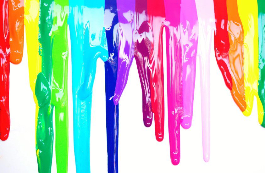
When it comes to decorating your home, colour is much more than just a visual choice—it’s a powerful tool that can influence mood, energy, and overall atmosphere. Whether you’re repainting a single room or designing an entire house, understanding the psychology behind colours can help you create spaces that feel perfectly aligned with your lifestyle and emotions.
Let’s dive into the fascinating world of color psychology and explore how you can use it to your advantage in your home.
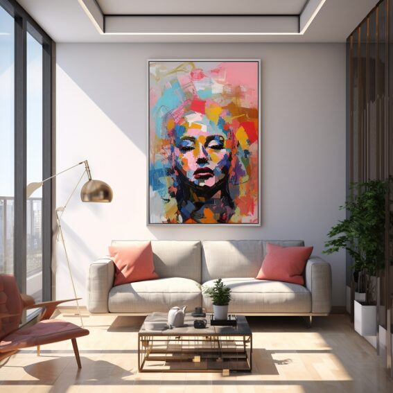
1. The Power of Colour in Interior Design
Colour is one of the most impactful elements in interior design. It sets the tone for a room, affects the perception of space, and can even influence your behavior and emotions. Each colour has its psychological effect, which can be used to create specific atmospheres in different areas of your home.
2. Blue: The Calming Influence
Blue is known for its calming and serene qualities, making it an ideal choice for bedrooms and bathrooms where relaxation is key. Lighter shades of blue can make a room feel open and airy, while deeper blues add a touch of sophistication and tranquility. This colour is perfect for creating a peaceful retreat in your home, helping to reduce stress and promote restful sleep.
Where to Use: Bedrooms, bathrooms, home offices, or any space where you want to encourage calmness and focus.
3. Green: The Colour of Balance and Renewal
Green is associated with nature, renewal, and balance. It’s a versatile color that brings a sense of freshness and harmony to any room. Green is particularly suited for spaces where you want to feel relaxed but also rejuvenated, like living rooms or kitchens. It pairs beautifully with natural materials like wood and stone, enhancing a sense of tranquility.
Where to Use: Living rooms, kitchens, and any area where you want to create a natural, balanced feel.
4. Red: The Energizer
Red is a bold, stimulating colour that evokes energy, passion, and excitement. It’s perfect for spaces where you want to spark conversation and activity, like dining rooms or entryways. However, because it’s such an intense color, it’s best used in moderation or as an accent to avoid feeling overwhelmed.
Where to Use: Dining rooms, entryways, or as accent walls and décor pieces.
5. Yellow: The Cheerful Brightener
Yellow is the colour of sunshine and happiness. It can instantly lift the mood of a room and is often associated with warmth and positivity. Lighter shades can make small spaces feel larger and more welcoming, while brighter yellows add a fun and playful touch. It’s a great color for energizing spaces where you spend a lot of active time.
Where to Use: Kitchens, breakfast nooks, and home offices.
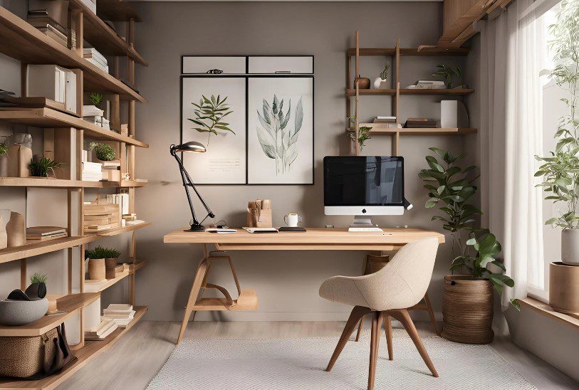
6. Neutral Colours: The Versatile Foundation
Neutrals like white, beige, and gray provide a versatile foundation for any room. They create a clean, calm backdrop that allows other colors to pop. White can make spaces feel larger and brighter, while gray adds a touch of elegance and modernity. Neutrals are also perfect for those who prefer a minimalist style or frequently update their décor.
Where to Use: Anywhere! Neutrals work in any room and can be easily paired with bolder colours.
7. Purple: The Luxurious Touch
Purple combines the calm of blue and the energy of red, often symbolizing luxury, creativity, and introspection. Lighter shades like lavender evoke a sense of tranquility, while deeper purples like plum can create a dramatic, opulent feel. Purple is perfect for adding a touch of sophistication and creativity to your home.
Where to Use: Bedrooms, creative spaces, and reading nooks.
8. Choosing Colours for Living and Resale Value
While it’s important to choose colors that make you feel comfortable and reflect your personality, it’s also wise to consider how your choices might impact the resale value of your home. Neutral tones like soft grays, beiges, and whites are universally appealing and can help potential buyers envision themselves in the space. Bold, personalized colours are great for expressing your style, but keeping the main living areas neutral can make your home more marketable in the future. Consider using bold colours in smaller doses, like accent walls or décor, so you can enjoy your personal touch without deterring potential buyers.
9. How to Choose the Right Colour for Your Space
When choosing colorus, consider the function of the room, the natural light available, and the mood you want to create. Here are a few tips:
- Test Samples: Paint small sections of your walls with samples and observe how they look at different times of the day.
- Consider Lighting: Natural and artificial lighting can change how colours appear. Cooler lighting works well with blues and greens, while warmer lighting enhances reds and yellows.
- Balance Bold with Neutral: If you love bright colours, balance them with neutrals to prevent a space from feeling overwhelming.
10. Final Thoughts
Choosing the right colours for your home is more than just a design decision—it’s a way to influence how you feel and function in your space every day. By understanding the psychology behind colours, you can create an environment that not only looks beautiful but also supports your well-being and lifestyle.
This blog was provided by The Dan Gemus Real Estate Team Ltd., Brokerage in Windsor and Essex County. We’re ingrained in the Windsor – Essex community and experts on the market. If you’re thinking of buying or selling in Essex County, we want to help you. Reach out to our team 7 days/week: 519-566-5565 and learn more about us online.